I embarked on this project build with some trepidation, as my thoughts/hypothesis felt fairly radical in the sense that my ideas about learning spaces were changing and one was left with the decision either to "play it safe" or try something innovative; I'm fairly certain that I chose the latter.
Playing it safe meant to build something traditional, which embraced the traditional metaphors of houses and buildings, things that users would immediately recognise. It quickly occured to me that there was no need for an avatar in Second Life to require a "house". I also thought that new users of Second Life would have little/ no expectation of a Second Life environment- why instill bad habits from the start?
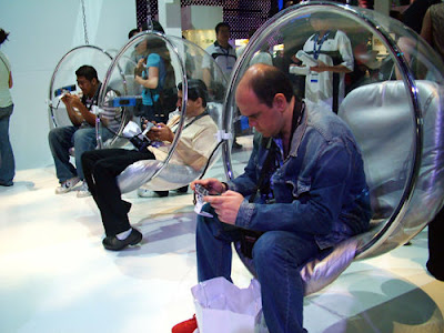
I tried to think about successful ways in which people congregate in spaces in the real world- this made me think of stadiums, theatre, but I was led to a more definitive idea which I thought worked really well- a tradeshow. The tradeshow is composed of stands and stalls whereby users can interact with stall holders and browse easily (and chat) with other individuals. Spaces are segmented in a logical sequence by using booths and attractive signage to guide the user around the space.
I contextually analysed the spaces used in tradeshows and the ways in which stalls were designed to allow people access to monitors and leaflets (and stall-holders) as well as the ability to move through the spaces with the greatest of ease.
The only drawback that I could think of, was that I was intentionally by-passing traditional modelling and metaphor which could be perceived as my lack of capability to model (which is not true) or my lack of inclination to "get in line" with the Second Life environment. This is not the case - my arguement in developing this kind of environment is that there is room to conceive and research different ways to develop learning spaces for interactive users which is user-friendly (end-user focused) and ultimately, future thinking.
The pedagogical aspects of this build relate to the ideals of Wengar's Communities of Practice - I believe that this kind of build is collaboration-friendly and geared towards communicating more freely (as opposed to locking ourselves away in small classrooms).
I see this build as an exemplar for prospective students oversees who might want to study at London Metropolitan University who want to see how we use technology and explore the International Ofiice in a virtual world. The university could put a link to this build from the International Office's web page.
I still believe that there is room for more development with this idea, and it would be good to see other parts of the university use this type of space in line with the 'Proud to be at Londonmnet'campaign.
Friday, 14 January 2011
Project Presentation
Presentation using Prezi
This was the first time that I had used Prezi and discovered a few issues with it. The first being that if you cluster objects too close together and create a path when you are in 'show' mode there is a chance that the path will get jumbled up. The other issue is that unlike PowerPoint that allows you to print out handouts with prezi you can only print to PDF, and depending on the amount of media that you have used the file size may be huge. My Prezi .pdf has 24 pages but a file size of 5.62MB.
Prezi can be viewed at:
https://prezi.com/secure/1387fcea97c49075f5dff613b7bd53c4d03cde8a/
Scripting Issues...
My experience with scripting languages is only with basic HTML. I will have to attend some basic scripting classes in SL and overcome this mini hurdle.
I'm thinking that it is a good idea to attach a script to the interfaces that show the web pages to enable the page to re-set itself after a certain time frame. This would mean that if the user was to use the links on the web page it would automaticaly return to the homepage. This is an issue that still needs to be addressed, and the llSetPrimMediaParams help can be found on the SL wiki site.
Second Life wiki [Online] Available at http://wiki.secondlife.com/wiki/LlSetPrimMediaParams accessed January 2011
Thursday, 6 January 2011
Signage...thoughts on semiotics
Signage for my project is proving to be very thoughtful and time consuming. I need it to be visible from all angles so no matter where an avatar 'drops in' they will be able to orientate themselves quickly. I've thought about semiotics, triangles being thought of as dynamic and squares of being boring/responsible. Entire society is conditioned around the square shape, for example windows, roads and buildings. We very rarely see the triangle shape used in society and culture, thus making it dynamic when we do see it.
The Scotland Yard image below creates a striking impression. The Helvetica font used immediately states 'trust, transparency, responsibility and modernity. The triangle shape signifies forward movement and dynamism. The sharp edges signify sharp minds, authority, assurance, truth and honesty.
The design of this signage has been a well thought out process with a deliberate subliminal message.

I have decided to create signage in the shape of a triangle, hopefully this will subliminally protray the message of an exciting and dynamic place to be. I think that this is possible by building a box and then cutting it in half, back to SL to try!
The Scotland Yard image below creates a striking impression. The Helvetica font used immediately states 'trust, transparency, responsibility and modernity. The triangle shape signifies forward movement and dynamism. The sharp edges signify sharp minds, authority, assurance, truth and honesty.
The design of this signage has been a well thought out process with a deliberate subliminal message.

I have decided to create signage in the shape of a triangle, hopefully this will subliminally protray the message of an exciting and dynamic place to be. I think that this is possible by building a box and then cutting it in half, back to SL to try!
Thursday, 30 December 2010
Building in SL
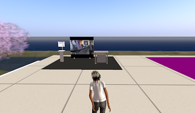
It surprised me when I started this build how much I'd actually forgotten about just navigating my avatar around in SL. This in fact has helped me with the build in so much as the ability to 'see' it as a new visitor, and to test the ease of access to the information. I'm pleased with the look of the 'unit' (can't quite make my mind up as to what to call it yet), I need to build four more units, I'm sure that you must be able to select all of the individual parts and 'lock' them together just like you can in Publisher, and duplicate the unit as one?
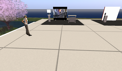
My first attempts at locking the individual parts together went well, it was tricky with the smaller parts and I had to constantly change the camera view to enable me to select them. I think the most frustrating part of the build so far is trying to get the right camera angle! I know that with practice it will become easier but - aaaargh!
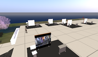
I've finally worked out how to duplicate! I had forgotton that you have to also hold down the left mouse button along with the shift key and drag the green arrow.
Monday, 27 December 2010
Even more design ideas
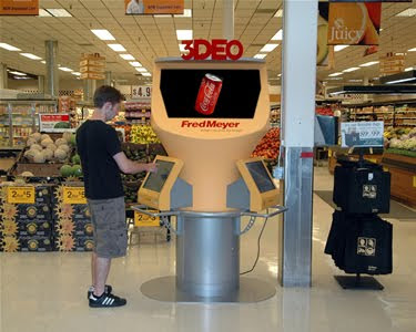
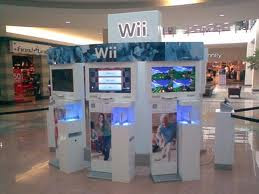
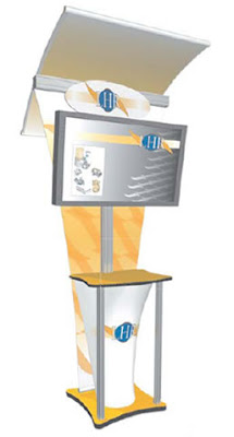

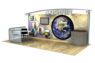
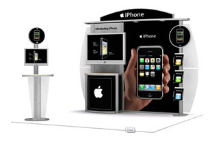
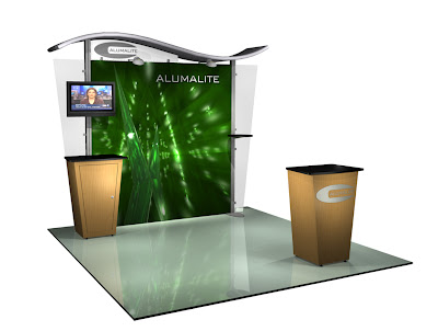

Having looked at various display desgin web sites and considered my target audience I have now decided to use a design simular to the above image. The idea being that the user can access the pod/display without too much navigation needed to get their avatar to the information. I will place a video (yet to be decided) on the back screen and place an interface with access to the International Office's web page on the smaller display screen.
More design ideas - images
Subscribe to:
Comments (Atom)


